20 pyecharts热力图
import random
from pyecharts import options as opts
from pyecharts.charts import HeatMap
def heatmap_car() -> HeatMap:
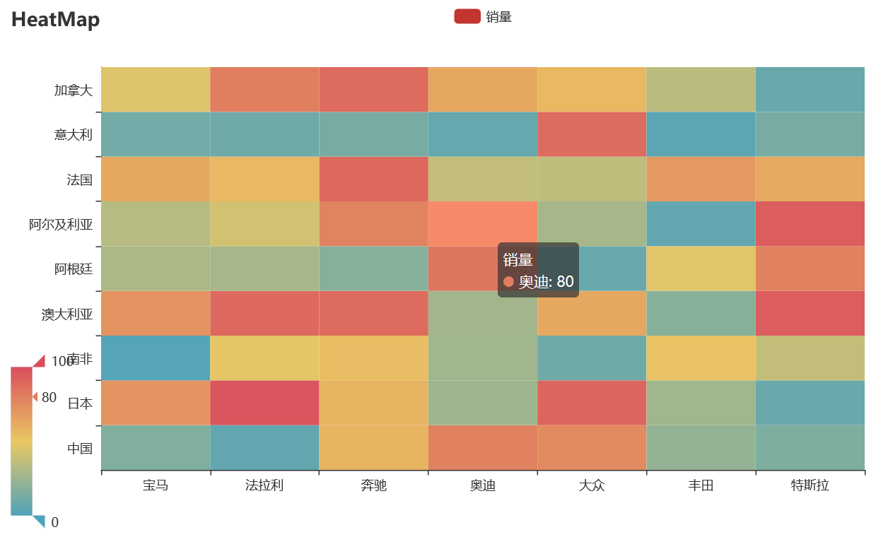
x = ['宝马', '法拉利', '奔驰', '奥迪', '大众', '丰田', '特斯拉']
y = ['中国','日本','南非','澳大利亚','阿根廷','阿尔及利亚','法国','意大利','加拿大']
value = [[i, j, random.randint(0, 100)]
for i in range(len(x)) for j in range(len(y))]
c = (
HeatMap()
.add_xaxis(x)
.add_yaxis("销量", y, value)
.set_global_opts(
title_opts=opts.TitleOpts(title="HeatMap"),
visualmap_opts=opts.VisualMapOpts(),
)
)
return c
heatmap_car().render('./img/heatmap_pyecharts.html')
热力图描述的实际是三维关系,x轴表示车型,y轴表示国家,每个色块的颜色值代表销量,颜色刻度尺显示在左下角,颜色越红表示销量越大。